
Built From the Ground Up:
Transforming Training Into a Scalable Brand Experience
Brand strategy, instructional design, and creative system development for Purpose-Built's educational program
5
Training modules, Series 01
8
Store locations, full rollout
4
Future series planned and scoped
7
Physical material types designed
2
Brand systems built (voice + visual)
What I Built
Brand Voice & Content Strategy Diagnosed a tone problem, retired a mascot character, rewrote curriculum copy across all 5 modules, created a voice and tone guide for future contributors.
Visual Identity System Extended PB's brand into a learning context: typography hierarchy, color palette, texture library, photography guidelines, icon system.
Physical Training Materials Learning guides, facilitator guides, behavior posters, progress tracking posters, evaluation scorecards, custom enamel pins, sticker sheets.
Digital Assets Presentation deck template with full asset library, module title slides, video graphics packages, quick-reference boot cards, intranet resource page.
Recognition & Engagement System 5 custom enamel pin designs, progress tracking wall posters deployed across all 8 stores, sticker sheets tied to module completion.
Scalability Framework Template systems for future series, design system documentation, naming conventions, voice guide written for non-designers — built so the program survives team changes.
Phase 1:
Strategic Diagnosis
The Disconnect
The training had real value. The operational lead, Andrea Franco, is a professional trainer with years of experience. Her teaching philosophy was embedded in the structure.
But the tone was off. A mascot character named Sparky appeared throughout, summarizing sections in a casual, jokey voice. Lines like "let's lace up and get started!" and "your feet will thank you!" were scattered everywhere. The intention was good—make dense material more relatable—but it was softening Purpose-Built's brand voice in a way that didn't match who they are.
Purpose-Built serves tradespeople. Their brand voice is rooted in straight talk. Confident, grounded, never overcomplicated. When you're teaching someone how to recommend the right boot for a lineman or electrician, the training needs to carry the same pride and professionalism that Purpose-Built shows in its products.
My Approach
Rather than jump into visual design, I stepped back and spent time understanding what was already there. I identified two things that needed to happen:
Articulate the teaching framework already working beneath the surface
Redefine the brand voice to match Purpose-Built's identity
These two pieces would inform everything else: the rewritten content, the visual identity, the physical materials, and the scalability plan.
What Was Already There
Purpose-Built hired me to design branded training materials for their new employee education program. The curriculum was already built. Videos were recorded, quizzes written, modules outlined. They needed someone to make it look good.
But when I started reading through the content, I found something bigger than a design problem.
Phase 2:
Framework & Voice Development
Recognizing the Framework
As I mapped out the flow of the five modules, I noticed Andrea's teaching approach. She didn't just throw information at learners. She built understanding in layers:
First, you learn about the products themselves (boot styles, outsoles, toe caps, features)
Then, you understand the context (what electricians face on jobsites vs. what roofers need)
Finally, you apply that knowledge to real customer interactions (making confident recommendations)
Defining the Voice
Once I understood this progression, the voice work clicked into place.
If the program was about building real expertise to serve tradespeople, the tone needed to match that seriousness. It couldn't be cutesy or performative. It needed to sound like Purpose-Built: confident, grounded, practical.
Rewriting the Content
I went through every module and rewrote the copy. The structure Andrea built stayed the same. The learning objectives stayed the same. But the voice changed completely.
The rewrite made the training sound like it came from someone who knows boots and respects the work, not someone trying to make learning "fun."
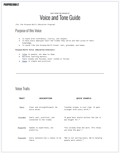
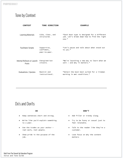
Voice & Tone Guide
To keep the voice sustainable as teams changed, I created a Voice & Tone Guide that anyone could use when writing training content.
The guide covered voice traits (direct, grounded, respectful, purposeful), tone adjustments by context (learning materials vs. facilitator scripts vs. evaluations), before/after examples, and quick-reference do's and don'ts.
This became the tool that kept all materials on-brand, even when different people contributed content.
How This Actually Happened
These pieces didn't happen sequentially. I was reading modules, recognizing Andrea's teaching pattern, wrestling with the tone problem, and rewriting content simultaneously. Each piece informed the others. The framework helped me understand what the voice needed to be. The voice work helped me articulate the framework more clearly.
The framework was there, it just needed to be pulled to the surface and identified in Purpose-Built’s identity:
Know the Gear → Product features, materials, how boots are built
Understand the Trade → Jobsite realities, what each trade faces
Support with Purpose → Putting knowledge into confident action
This became: "Understand the Trade. Know the Gear. Support with Purpose."
The framework gave me clarity on what the voice needed to do.
It needed to:
Respect the intelligence of retail employees learning complex information
Match the professionalism Purpose-Built shows tradespeople
Build confidence through knowledge, not forced enthusiasm
Before (original casual tone):
"Ready to step up and make some great sales? Let's lace up and get started!"
After (revised voice):
"Every module is built to help you recommend boots with confidence, match the right product to the right job, and speak with purpose, not guesswork."
The Outcome
By the end of this phase, the program had a clear framework, brand-aligned voice, rewritten content, and strategic documents that would survive team changes. The framework wasn't invented—it was Andrea's approach, made visible. The voice wasn't arbitrary—it came from understanding what the program was really about.
Pitch Deck


Training Deck


Phase 3:
Physical Engagement & Progress Design

The Problem with Digital-Only Training
When training lives entirely online, progress feels invisible. You finish a module, close the browser, and it's gone. There's no trace of accomplishment, no way to see how far you've come or how much your team has completed.
I wanted to bring that progress out into the open and really make this training impactful.
Progress Tracking System
Each store received a progress poster for their backroom wall (28x22"). Every employee's name was listed. When they completed a module, they added a sticker next to their name.
Over time, the wall filled in with color and movement. Learning became visible. It became a shared effort rather than an individual task hidden in a learning management system.
Teams started checking on each other. Asking who was caught up. Celebrating when everyone finished a series. The poster created natural accountability without feeling like surveillance.
Recognition System
I designed custom enamel pins for each completed module. Boot icons, safety symbols, simple designs that connected to the material. Employees added them to their lanyards as they progressed through the training.
This was an idea from Andrea, and these pins became the stickers and interaction catalyst for the progress tracking poster.
The pins were a great idea. When I worked at Starbucks many moons ago, we had recognition pins. You got a pin when you did something outstanding and really, truly above and beyond. When partners would get these pins, they added them to their aprons. It was impactful, it was encouraging the behaviors, and it was carrying the Starbucks brand and mission statement through a form of self-expression via aprons.
Why Physical Matters
Progress that can be seen or held is easier to believe in. When you can complete a module and physically add your sticker to your section on the wall, or look down at your lanyard and count your pins, the learning feels real.
In a work environment where most training happens through screens, these small physical gestures gave the program warmth and presence. They helped the learning feel grounded in the same way Purpose-Built's products are: built to last, built with care, built for real people. The design and execution of the pins and materials also played into this impact. They had to be well designed, relevant and branded, and presented and onboarded correctly.
Designed for Reality
The materials were intentionally affordable and easy to reproduce. Pins were small. Stickers could be printed in bulk. Posters were simple to replace.
Accessibility was part of the design logic. Engagement shouldn't depend on budget. It should depend on thoughtfulness.
Phase 4:
Visual Identity & Creative System
The Design Challenge
Build a visual identity that:
Felt distinct from the retail brand but still connected to Purpose-Built
Could flex across physical materials, digital modules, and future training series
Was simple enough for small creative teams to maintain as the company grew
Brand Identity System
I extended Purpose-Built's brand into a learning context:
Typography hierarchy for training materials that balanced readability with brand character
Color palette that referenced the retail brand without duplicating it
Texture library (grit, concrete, blueprint patterns) that could be applied across all series
Photography style guidelines for consistency in visual storytelling
Icon system for modules, achievements, and quick-reference materials
Designing for Scalability
The visual system was built to survive team changes and growth. I created:
Template systems for future series (presentation decks with full asset libraries)
Design system documentation showing how to use textures, when to apply brand elements, and how components work together
Modular components that non-designers could combine and use confidently
Asset libraries organized for easy access and reuse
This meant future training series could maintain brand consistency without requiring a designer for every piece. The system works because someone new to the company can understand it without a long explanation.
Physical Materials Designed
Learning Guides (8.5"x5.5" notebooks) with key points and note-taking space
Facilitator Guides with coaching frameworks for store leaders
Progress Tracking Posters (28x22") for team completion visibility
Behavior Posters (11x17") reinforcing F-word behaviors in backrooms
Evaluation Scorecards (2.75"x8.5") for manager observations
Custom Enamel Pins (5 designs) for module completion
Sticker Sheets matching pins for progress tracking
Digital Assets
Presentation deck template with complete asset library
Module title slides and section headers
Video graphics packages
Quick-reference boot cards for the sales floor
Digital versions of all print materials for internal sharing off their intranet
Intranet resource page


FURTHER READING
Designing Reward Systems for Real People
On why physical progress matters and how the pin and poster system came together.
Redefining Purpose-Built's Learning Voice
On diagnosing brand voice problems and building systems that survive team changes.